
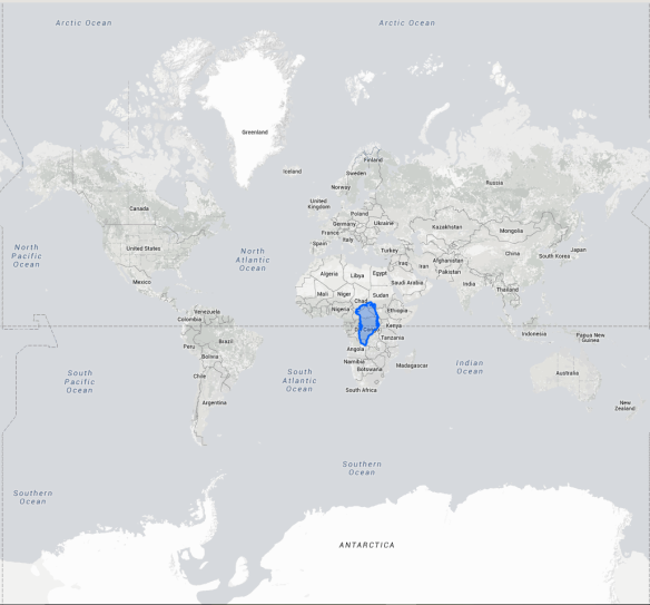
That blue highlight is Greenland compared to the size of Africa.
The curiosity for the size of one thing compared to another is something that has always existed in our minds. Luckily, there’s a site that allows you to compare the sizes of countries and states together.
The True Size Of… lets users interact with countries and states in order to compare the size of each of them. Users can type in the country or state they wish to compare, and then that area will be highlighted on the map. Once the highlighted map appears, left-click and hold the highlighted area and drag it anywhere on the map. Yes, there can be multiple highlights on the map. Want 24 different colored highlights of Sweden? Go do it. Right-click to delete the highlighted area when it’s no longer needed. Users can also grab the little Google Street View guy on the bottom-right of the site. The yellow figure can be placed down on the map to go into Google Street View.
Another neat trick about this site is that it takes in the effect of the Earth’s roundness. Flat maps, like the common Mercator, have the continents distorted and wrongly sized. IFL Science goes into depth about how the Mercator map doesn’t show actual sizes. Buzzfeedblue posted a video explaining and showing the difference between the map and actual sizes.
The True Size Of… is a great way to kill time with curiosity. Students could also use this in projects or to prove someone else wrong. Go ahead and see how big Antarctica really is. Overall, this site is helpful, and fun to mess around with!
Here’s the link: thetruesize.com
